Unlocked Maps Case Study
Designing an inclusive map experience
My Role
I was the sole UX designer working with a developer. I created all the visuals for the project.
Project Background
Searching for wheelchair accessible transit stations was difficult and finding out if an elevator was out even more challenging.
Logo Redesign
The developer who I worked with on this project had a previous iteration of his accessible station map. The project originally started in Philly and using data available directly from the transit authorities populate a specific map.
Our vision for this project was to expand to any major city that had open data to use, and so the name and logo needed a redesign. We changed the name from Unlocked Philly to Unlocked Maps.
Research
I spoke with two wheelchair users in Chicago who use the CTA stations regularly. We asked them to speak about how they check if a station they are going to is accessible. Both said they will mainly check stations they don’t visit regularly.
We created an empathy map based on what we learned to help better express how challenging it can be to find information. The empathy map was a good discussion tool to understand the pain points that took the biggest toll.

One of the main insights gained from research was that elevators being out was definitely the most unpredictable obstacle, and one they cared about the most. Users would often not find out about an elevator outage until they arrived at the platform and were stuck.
Designing the interface
Sketching out the new interface was a quick way for me to show my counterpart my ideas. I provided wireframes to outline the basic features needed for the design.

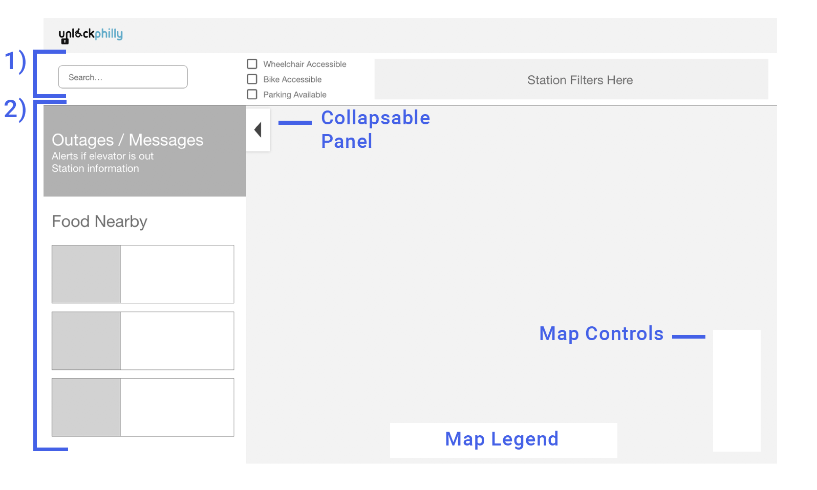
During our research we realized people were very familiar with the layout and feel of conventional map programs. Once my developer counterpart approved the functionalities, we moved onto higher fidelity screens.
Key Features
Able to view accessible train stops on map view
Functionality to check if elevator is out of service
Accessible restaurants nearby
Search by station functionality
Ability to filter different transit lines
Ability to filter three major accessibility options, parking nearby, bike, and wheelchair accessible
Push notifications if station is out of service
Design Considerations
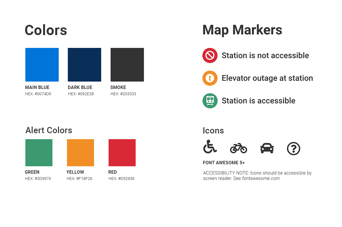
High contrast Icons on map with distinct color difference and icon difference
Distinct sections for better flow
Large buttons
Larger section for transit line filters
Clear hierarchy of page

Search functionality for finding a station specifically by name

If they search or click a station icon on the map this page will display.

The station cards have three visual states to them depending on the current status of the station they searched for.
A green border at the top, and wheelchair icon indicates station is accessible and no outage reported.
If a station has no elevator at all the top border is red. An absence of the wheelchair icon was not directly clear enough to show station wasn’t accessible, so a second indication was added for clarity.
Showing an elevator outage is a critical feature of this project, and that is shown with a yellow boarder as well as an error showing an outage has been reported.
Future features
Plan a route feature
Service outage reporting form
Other accessible entertainment options